FASHIONGO Vendor page renewal — April 2026Led the mobile UI design and assisted with the web UI design for the FASHIONGO Vendors page:
Pain pointsThe previous version of the vendor page was efficient for the amount of vendors on the website, but lacked discoverability:
Vendor list is long and hard to navigate (no filtering or categories)
Lack of discoverability or promotions
Visually lacking and clunky
Previous design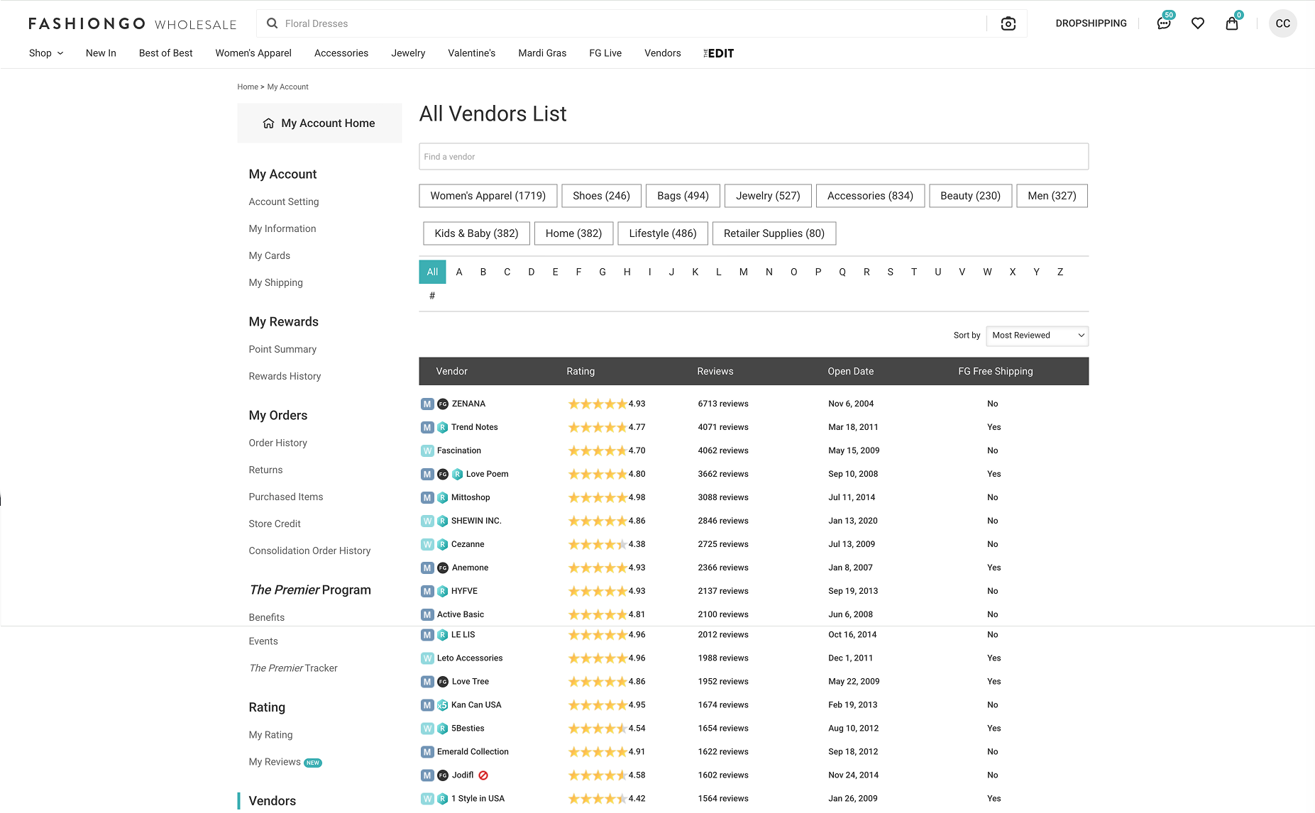
Visually unappealing
Low discoverability
Pretty much just a list of vendors
Outdated from the rest of the website
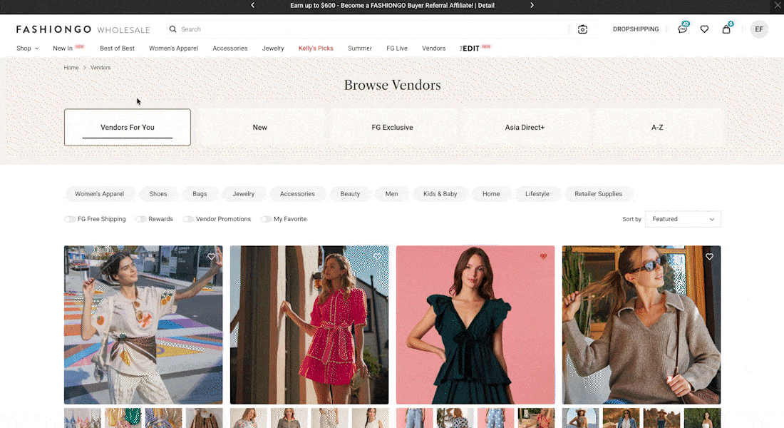
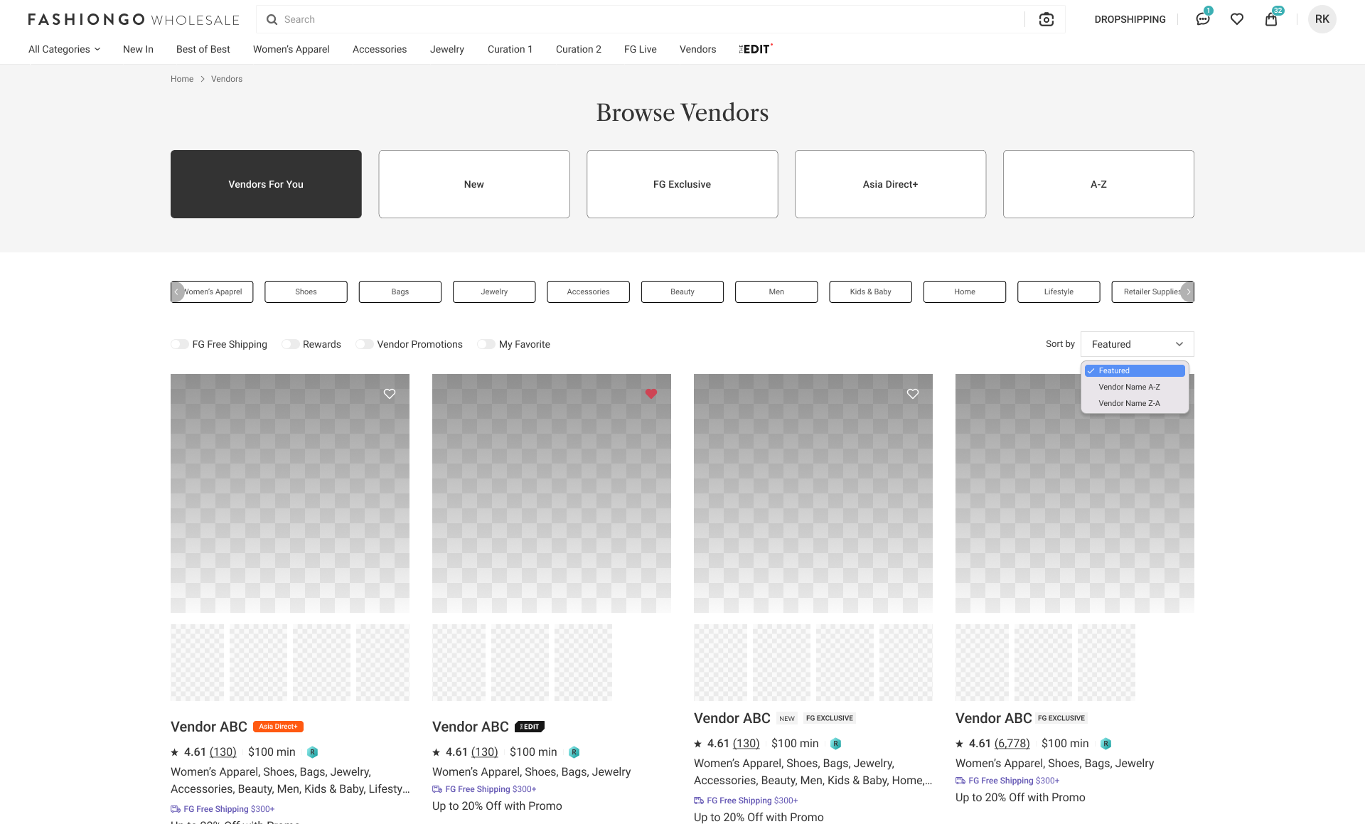
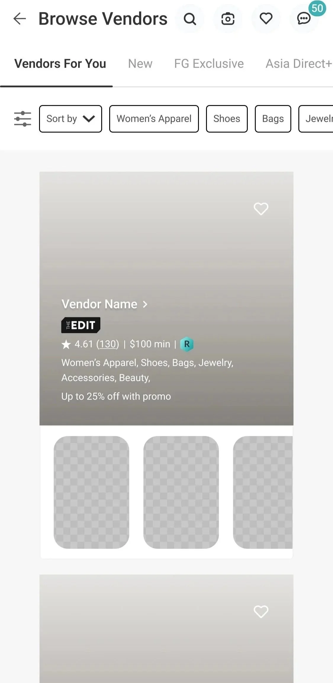
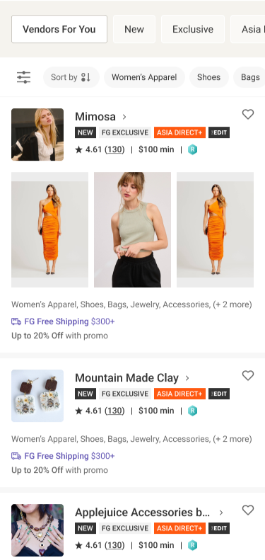
WireframeThe main goals of this revamp were to increase vender discoverability and add filtering capabilities, as well as elevate the visual experience of the page.
The wireframe was provided by the FASHIONGO UX team.
EARLY ITERATIONS
EARLY VERSION
EARY VERSION
LATER PROPOSAL
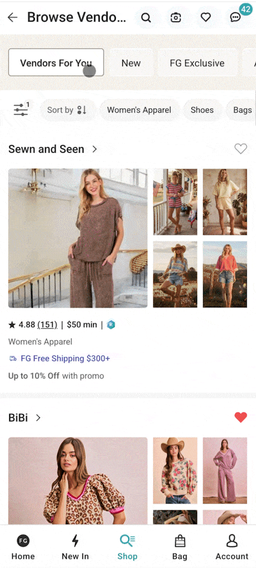
After feeling the design per vendor was too long on mobile, we decided to revisit the layout.
There is also a case where the user is not logged in in which some information is hidden.
The designs were adjusted to better accommodate this.
**Note: The early version of desktop was handled by another designer, so less change is visible.
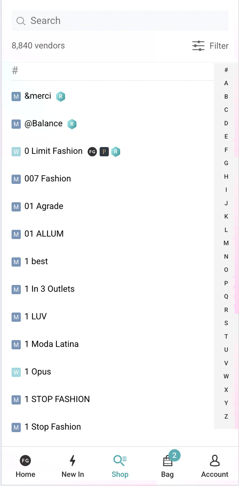
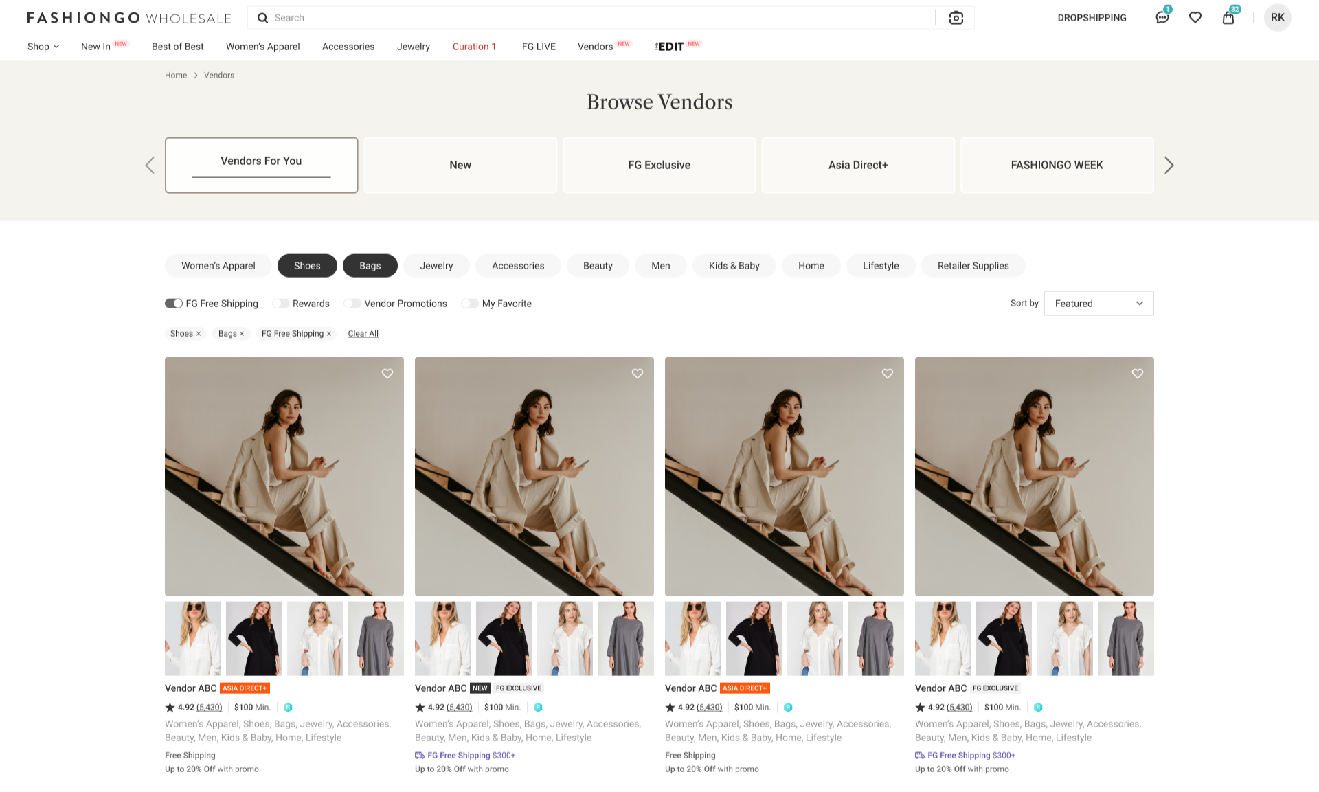
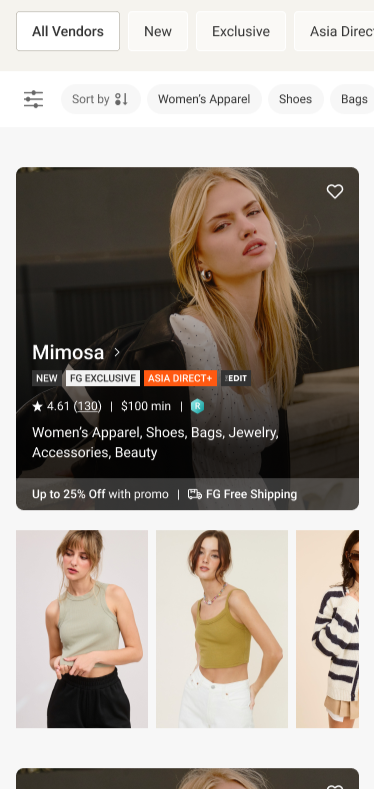
FINAL VERSIONS